
Journals79
Newest
Commissions Open!
4 min read
HEY EVERYONE, it's been so long D: How's everybody doing? I've been busy with my projects and MOVING across the country n stuff... :'D
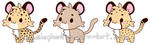
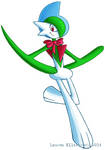
Sooo I've never really opened commissions before because I don't have a lot of recognition on this site, and I figured no one would commission me anyway, but since moving out I really need grocery money - that's my top priority right now. I'll post some of the art I've kept hidden for years (not my top secret project yet) for some examples.
I can draw humans, animals, dragons, basically any creature and I specialize in facial expressions. Please provide me with a reference of your character, or if you're not an artist and want to work with me to create your vision, I can do that too. Stuff I won't draw: female NSFW.
Note me and I'll send you my paypal. I get paid in advance only because of how many stories I hear where an artist does the work and the commissioner doesn't pay them.
UPDATE: If you're commissioning a colored drawing, I'll show you the sketch and if you're happy with it so far, you pay half now, half later. For full illustrations, I'll show you the progress along the way so you can make sure it meets your standards.
PRICES:
Colored (not shaded) chibi character, animal, Pokemon, etc: $8 <<best way to help me out if you're broke too.
Refined sketch/basic drawing of one character: $18
Colored and shaded drawing of one character (no background): $35
Colored and shaded drawing of one character with a simple/abstract background: $40


Full art/illustration: $75


Side note: I entered the Devious Dreams thing with my top-secret project! I'll post about it one of these days, but I'm still really paranoid about theft... :/
Sooo I've never really opened commissions before because I don't have a lot of recognition on this site, and I figured no one would commission me anyway, but since moving out I really need grocery money - that's my top priority right now. I'll post some of the art I've kept hidden for years (not my top secret project yet) for some examples.
I can draw humans, animals, dragons, basically any creature and I specialize in facial expressions. Please provide me with a reference of your character, or if you're not an artist and want to work with me to create your vision, I can do that too. Stuff I won't draw: female NSFW.
Note me and I'll send you my paypal. I get paid in advance only because of how many stories I hear where an artist does the work and the commissioner doesn't pay them.
UPDATE: If you're commissioning a colored drawing, I'll show you the sketch and if you're happy with it so far, you pay half now, half later. For full illustrations, I'll show you the progress along the way so you can make sure it meets your standards.
PRICES:
Colored (not shaded) chibi character, animal, Pokemon, etc: $8 <<best way to help me out if you're broke too.
Refined sketch/basic drawing of one character: $18
Colored and shaded drawing of one character (no background): $35
Colored and shaded drawing of one character with a simple/abstract background: $40
Full art/illustration: $75
Side note: I entered the Devious Dreams thing with my top-secret project! I'll post about it one of these days, but I'm still really paranoid about theft... :/
Join the community to add your comment. Already a deviant? Log In
Successful Background Notes
3 min read
Jeeeez, I haven't been on in a million years! Well, my significant other has moved in with me so it's been a while getting situated. Anyways I was going around my "for reference" collection, including some papers I got in my classes, and writing up notes on how to make a successful background (as well as a scene as a whole). Does anyone have anything to add?
-abstract backgrounds (may or may not be traditionally-painted) are okay on a close-up with extreme emotion, and only rarely ((this one is specific to me and my book illustrations))
-start with a thumbnail that shows composition and value/lighting estimations
-when adding value and tone, simplify mass tones first
-limit the tones to 3-5 values in the initial stages
-overlap stuff to show depth
-progress to the darkest colors to avoid missing important values
-background has the least amount of contrast (and saturation), middleground is normal, and foreground has the most; however, remember that the focal point is achieved by lots of contrast
-only use colored outlines (except of course in dark/black areas); faraway low-contrast scenery should have no outlines (should colored outlines apply to the characters too? if so, they should still be darker than background outlines) ((again, this applies to my art and my preferences))
-turn the scene to grayscale to test hues and if the character stands out from the background
-avoid symmetry
-have dynamic angles; no horizontal or vertical lines
-avoid tangential lines
-avoid the temptation to move on or add details until it is appropriate
-always refer to the whole and don't concentrate on a small peripheral focus for too long; constantly check relationships of one area's value/shape to another (squinting helps)
-remember cast shadows
-composition is about guiding the viewer's eye around a pic:
-to go this way, use: graduations/gradations, continuations, soft edges, open shapes, similar colors (values, temperatures, intensities), overlapping
-to go another way, use: sudden contrasts, blocking or ending edges or lines, hard edges, closed shapes, contrasting colors
-long/wide horizontal lines/shapes: repose, calm, peace, restfulness, finality, space, quiet, depth
-long/high vertical lines/shapes: dignity, austerity, height, imperious, tension, strength, monumental
-diagonal strokes/shapes/lines: tension, dynamics
-gothic arch: mystery, contemplation, aspiration, spiritual, awe
-vertical and horizontal lines together: stolidity, enduring, solidity, protective, stubbornness
-curvilinear shapes/lines and subtle changes of direction create fluidity
-remember line of action
-make sure the silhouette clearly shows the character's pose, as well as mood
-poses have to give a clear understanding of the shot
-get contours right (in shading/highlighting) to show volume convincingly
-think about a shape as a box to know how much of a plane would be shaded/highlighted; consider planar changes, like where one plane would end and another begin
-again, cast shadows exist
(I constantly forget about cast shadows because I rarely draw full scenes)
If you have any more advice or want me to elaborate on anything, lemme know in the comments! Feel free to save this as your own reference if you want to as well. Let's all add to it!
Background Notes
-blur the foreground and/or background when the character's expression/internal feelings and emotions are important (or when it looks cool)-abstract backgrounds (may or may not be traditionally-painted) are okay on a close-up with extreme emotion, and only rarely ((this one is specific to me and my book illustrations))
-start with a thumbnail that shows composition and value/lighting estimations
-when adding value and tone, simplify mass tones first
-limit the tones to 3-5 values in the initial stages
-overlap stuff to show depth
-progress to the darkest colors to avoid missing important values
-background has the least amount of contrast (and saturation), middleground is normal, and foreground has the most; however, remember that the focal point is achieved by lots of contrast
-only use colored outlines (except of course in dark/black areas); faraway low-contrast scenery should have no outlines (should colored outlines apply to the characters too? if so, they should still be darker than background outlines) ((again, this applies to my art and my preferences))
-turn the scene to grayscale to test hues and if the character stands out from the background
-avoid symmetry
-have dynamic angles; no horizontal or vertical lines
-avoid tangential lines
-avoid the temptation to move on or add details until it is appropriate
-always refer to the whole and don't concentrate on a small peripheral focus for too long; constantly check relationships of one area's value/shape to another (squinting helps)
-remember cast shadows
-composition is about guiding the viewer's eye around a pic:
-to go this way, use: graduations/gradations, continuations, soft edges, open shapes, similar colors (values, temperatures, intensities), overlapping
-to go another way, use: sudden contrasts, blocking or ending edges or lines, hard edges, closed shapes, contrasting colors
-long/wide horizontal lines/shapes: repose, calm, peace, restfulness, finality, space, quiet, depth
-long/high vertical lines/shapes: dignity, austerity, height, imperious, tension, strength, monumental
-diagonal strokes/shapes/lines: tension, dynamics
-gothic arch: mystery, contemplation, aspiration, spiritual, awe
-vertical and horizontal lines together: stolidity, enduring, solidity, protective, stubbornness
-curvilinear shapes/lines and subtle changes of direction create fluidity
Character/Subject Notes
-push your poses-remember line of action
-make sure the silhouette clearly shows the character's pose, as well as mood
-poses have to give a clear understanding of the shot
-get contours right (in shading/highlighting) to show volume convincingly
-think about a shape as a box to know how much of a plane would be shaded/highlighted; consider planar changes, like where one plane would end and another begin
-again, cast shadows exist
(I constantly forget about cast shadows because I rarely draw full scenes)
If you have any more advice or want me to elaborate on anything, lemme know in the comments! Feel free to save this as your own reference if you want to as well. Let's all add to it!
Join the community to add your comment. Already a deviant? Log In
Plush Wing Tutorial?
1 min read
Heeey, it's been forever! Been playin- I mean, working on super-secret projects I can't post about. In between writing and drawing, I'm *FINALLY* going to start on some HUUUGE plushies of my characters now that I've finally decided on a size. One of my characters has feathered wings and I was wondering if anyone wants me to make a tutorial on poseable plush wings using fabric instead of real feathers. You might even be able to make some to wear, who knows! Whether people are actually going to use it or not, I'll likely make a tutorial anyway, just to have something to post here. It won't be for a while as I'm still drawing the sketches and figuring out proportions before I actually make the patterns.
Join the community to add your comment. Already a deviant? Log In
Shiny Hunting and Y
2 min read
EDIT: After 1,058 eggs, I GOT MY SHINY GASTLY!!! And dangit, I can't find my camera or I would love to show him off! XD He's male like I wanted so I named him Henry after the white-haired dark mage from Fire Emblem Awakening. Timid, Moon Ball, IVs are 31/xx/xx/31/31/31 with outstanding potential so I'm very happy with that. This is the first shiny I got with the Masuda Method and my second shiny ever hatched (my first shiny ever was a random hatched Absol in the original Ruby, so it was about time for another!).
Yep, time for a Pokemon post! In the hype of Sun & Moon, I've started playing Alpha Sapphire again. I completed the Pokedex and got the shiny charm, and right now I'm a ridiculous 854 eggs into a shiny Gastly MM hunt. I'm SO TIRED of seeing purple! XD I have a TON of spare 5IV timid Gastlys in Moon Balls though - I'm like the crazy Gastly lady over here! Anybody want one?") (no really)
(no really)
I also RE-ordered Pokemon Y. I had ordered it about a week ago from Amazon, and I ended up getting a foreign copy, which isn't playable on my system since those games are region-locked. But the seller was from the US like me... o_O At least returning it was free and I got my refund quickly. Today I ordered it from pokemoncenter.com, from whom I have ordered games before, plus they only ship to the US so I should be safe. The only reason I didn't do that in the first place was because I didn't have enough money to qualify for free shipping. XD This time I had more money so I'm getting a Pumpkaboo plush and a Shiny Mega Gengar t-shirt (to match my future shiny!) and that got me free shipping so YAY.
I'm hoping this shiny hunt will be over soon because my next hunt will be for a Litwick, which I have been wanting for years! Wish me luck!
Yep, time for a Pokemon post! In the hype of Sun & Moon, I've started playing Alpha Sapphire again. I completed the Pokedex and got the shiny charm, and right now I'm a ridiculous 854 eggs into a shiny Gastly MM hunt. I'm SO TIRED of seeing purple! XD I have a TON of spare 5IV timid Gastlys in Moon Balls though - I'm like the crazy Gastly lady over here! Anybody want one?
I also RE-ordered Pokemon Y. I had ordered it about a week ago from Amazon, and I ended up getting a foreign copy, which isn't playable on my system since those games are region-locked. But the seller was from the US like me... o_O At least returning it was free and I got my refund quickly. Today I ordered it from pokemoncenter.com, from whom I have ordered games before, plus they only ship to the US so I should be safe. The only reason I didn't do that in the first place was because I didn't have enough money to qualify for free shipping. XD This time I had more money so I'm getting a Pumpkaboo plush and a Shiny Mega Gengar t-shirt (to match my future shiny!) and that got me free shipping so YAY.
I'm hoping this shiny hunt will be over soon because my next hunt will be for a Litwick, which I have been wanting for years! Wish me luck!
Join the community to add your comment. Already a deviant? Log In
What are You? Meme
15 min read
Jacked from 
Outcast
[x] You don't have very many friends.
[x] Often times, teachers forget your name.
[x] You were always picked last for kickball.
[x] You don't like to talk a lot.
[x] You tend to avoid mass social activities.
[x] You don't participate in any extracurricular activities.
[ ] All you wish for is to move away or get a fresh start.
[x] Your friends have blown you off before.
[x] You sit alone in most of your classes.
[x] You have a feeling that once you leave high school or college, nobody is going to remember you. (I left a long time ago and no one cares)
[x] You hold interest in activities that other people find strange.
[x] People don't find you friendly.
[ ] You hold extreme hate towards another high school stereotype.
[x] You eat alone at lunch.
Total = 12
Party Girl/Boy
[ ] Lets face it: you like to party.
[ ] You party every other weekend.
[ ] ...Or every weekend?
[ ] You've been going to frat house parties since early high school.
[ ] You're the defending beer bong champion.
[ ] You know the best hook-ups in the state... world.
[ ] Everybody who's anybody goes to the same parties you go to.
[ ] You've hooked up at parties.
[ ] You spend time getting ready for parties.
[ ] You've passed out from being too drunk.
[ ] You've partied all night.
[ ] You've snuck out of the house to party.
[ ] Actually, your parents really don't care if you party or not.
[x] You're pretty much nocturnal.
[ ] You like to go clubbing.
[ ] You and your friends always party hop.
[ ] You've crashed a party before.
[ ] One way or another, you've wound up naked in front of everybody at a party.
[ ] You've thrown up from drinking too much.
[ ] You've done something that you regret at a party.
[ ] You can dance.
[x] You're friends with a lot of people older than you.
Total = 1
Scene Kid
[ ] You know what sXe and hXc actually mean.
[x] You have a obsession with dinosaurs, robots, and Pokemon.
[ ] You idolize Jeffree Starr.
[ ] People have called you scene before.
[ ] You spend at least an hour getting ready to take pictures of yourself for your myspace. (How old is this meme??)
[ ] You have a mirror pic.
[x] You listen to bands that most people have never heard of.
[ ] You enjoy going to shows.
[ ] You only go to shows for the sake of going to shows, not the music.
[ ] Your hair is multicolored.
[ ] You accessorize your hair with kiddie barrettes and bows.
[ ] Fashion is one of the most important things that define you.
[ ] You mosh.
[x] You often mix vintage with modern.
[ ] Your myspace picture captions are sad lyrics to sad songs.
[ ] All of your friends are scene.
[ ] You don't know many of the people on your friends list in person.
[ ] You take angled pictures of yourself.
[ ] You enjoy photography.
Total = 3
Prep
[x] You pop the collar.
[ ] You won't go near the "goths".
[x] You own at least one thing from a designer store.
[ ] You are very clean cut.
[ ] You are squeamish.
[ ] People have called you preppy before.
[ ] You never leave the house without putting on cologne/perfume.
[ ] You have a lot of money.
[ ] You know who LC is.
[ ] You watch shows like The OC, The Real World, The Hills, and Laguna Beach.
[ ] One favorite stores are Abercrombie & Fitch or American Eagle Outfitters.
[ ] You're afraid to set foot into Hot Topic.
[x] (Girls) You carry a purse wherever you go.
[ ] You need to wake up at least an hour before school so you can get ready.
[ ] (Girls) You do not leave the house without make up.
[x] You are content overall with how your life is going.
Total = 4
Band Geek
[x] You have played an instrument before. (piano and cello)
[x] You still play an instrument.
[ ] You are/were in regular Band.
[ ] You are/were in Jazz Band.
[ ] You are/were in Marching Band.
[ ] You've never dated anybody outside of Band.
[ ] Most of your friends are in band.
[ ] The band room/band hall is your second home.
[x] You enjoy listening to Classical music on occasion.
[ ] You aspire to be a Drum Major.
[ ] You've made out with somebody on a Band bus or at a Band competition.
[ ] You have trouble getting your non-band friends to go near the band room.
[ ] Band is your favorite class.
[ ] You have been to band camp.
[ ] You walk in step with all your friends.
[ ] You talk about band constantly.
[ ] You know that American Pie has got it all wrong.
[x] You hate rap music.
[ ] Marching Season is your favorite time of year.
[ ] When you go to football games, you don't really pay attention to the game itself.
[ ] Your favorite jokes are band jokes.
[ ] You know it's not about the bloods and the crips: it's the brass and the woodwinds.
Total = 4
Thespian
[x] You have been in a school play.
[x] You have seen a Broadway musical.
[x] You like to act.
[x] You have participated in a school play. (wasn't this already asked?)
[ ] You have participated in a play outside of school.
[ ] You have gone to the Thespian Conference.
[ ] You get ticked off when people make that thespian, "Did you say lesbian?" joke.
[ ] You have done tech.
[ ] You know that you cannot touch anybody else's props.
[ ] You have played in the pit orchestra for a musical.
[ ] You have been to a cast party.
[ ] You are in a thespian troupe.
[ ] You often sing show tunes at the top of your lungs.
[ ] You know who Idina Menzel and Johnathan Larson are.
[ ] At one point in your life, you were obsessed with RENT.
[ ] You do not have a personal bubble.
[ ] You actually understand Shakespeare.
[ ] You know how to put on stage make up.
[ ] You have been a lead.
[x] You met a lot of your better friends through theatre.
Total = 5
Overachiever
[ ] You participate in a lot of extracurricular activities.
[ ] You have a part-time job. (wouldn't a full-time job be more overachiever?)
[ ] You have straight As.
[ ] You are in mostly honors/IB/AP classes.
[ ] You do not procrastinate.
[ ] You have scored a 5 on an AP test.
[ ] You do not have very much down time.
[ ] You are very organized.
[x] You always have a thousand things going on at once.
[ ] You are in a relationship.
[ ] You aspire to get into an Ivy League School.
[ ] In your extracurriculars, you hold leadership positions.
[ ] You are/were on Student Council.
[ ] You are/were the class president.
[ ] You are/were a class officer.
[ ] You are/were the Salutatorian for your class.
[ ] You are/were the Valedictorian for your class.
[ ] People have told you that you didn't have a life.
[ ] You are getting/have already received the IB Diploma.
[ ] You cry hysterically when you get anything lower than an A on anything.
Total = 1
Slacker
[x] Your grades are slipping. (they were for a long time when I was in high school)
[x] You always wait until the last minute to do big projects.
[x] You are an overall procrastinator.
[x] You tend to do your homework when you're watching TV.
[x] It takes you ages to turn your job applications in. (I still have one sitting around from last month)
[ ] You are often late to school/work.
[x] You don't turn in a lot of your work.
[x] You spend the majority of your time watching TV, the computer or going on Myspace when you could be doing something more productive.
[x] You sleep in past noon on the weekends and during the summer.
[x] You do not get out of your pajamas unless you have to leave the house.
[x] You could walk, but you'll just drive.
[ ] You have fallen asleep during class before.
[x] Friends have called you lazy.
[ ] Life is hard when you lose the remote & you have to walk a million miles over to the TV and change the channel. (back in my day, I had no remote XD)
[x] When you hang out with your friends, the majority of your time is spent playing video games or doing something where neither of you have to stand up.
[ ] You have eaten an entire pint of ice cream in one sitting.
[x] You have sat through an entire running marathon of a show before.
Total = 13 (beat that!)
Goth
[ ] Your wardrobe consists of mostly black things.
[x] When you have the money, you shop at Hot Topic.
[ ] You think tattoos are hot.
[ ] You think odd piercings are hot.
[ ] You don't get along with your parents.
[ ] You have/want to dyed/dye your hair an exotic color.
[ ] You've styled your hair in liberty spikes.
[ ] Sometimes you ponder the meaning of life and death.
[ ] You like to write dark poetry.
[ ] You are into S&M.
[ ] You have a pair of over sized black pants.
[ ] At one point in your life, you liked Foamy, Happy Bunny, Emily the Strange, and the Happy Tree Friends.
[x] You listen to grunge.
[ ] You have a messenger bag with buttons up and down the straps.
[ ] You smoke cigarettes.
[ ] You will only date other Goths.
[x] You don't really care what people think about you.
[x] Overly happy people scare you.
[ ] You like black makeup & nail polish best.
Total = 4
Nerd
[x] You actually study for tests and quizzes.
[ ] You have straight As.
[ ] You haven't had any luck with the opposite sex. (weeellllll I don't WANT any luck so does that count?)
[ ] You are into WoW, Magic Cards, and Halo.
[x] You over analyze jokes to the point where they aren't funny anymore. (LOL)
[x] Your mom buys your clothes for you. (I haven't bought any new clothes in over a year)
[ ] You actually answer the questions in class.
[x] You sit front row center in all of your classes to get the best learning experience. (bahaha)
[ ] You miss school during the summer.
[ ] You wear your pants at your waist.
[ ] You prefer sweatpants to jeans.
[ ] You have a pocket protector in your shirt with pens and a calculator in it.
[ ] You let cute boys/girls take advantage of you & copy your homework in hopes of getting noticed.
[x] You've noticed some of the spelling and grammar mistakes in this survey.
[x] People always cheat off you during tests.
[ ] Your parents pack your lunch for you every day.
[x] You wear/should be wearing glasses. (I had LASIK but my eyes are getting bad again)
Total = 7
Garage Band Junkie
[ ] You play the guitar.
[ ] You have been in a garage band before.
[ ] You're still in a garage band.
[ ] You think your band is going to make it big someday.
[ ] You play shows almost weekly.
[ ] You play the drum set.
[ ] You sing vocals for a band.
[ ] You write your own lyrics.
[ ] You spend hundreds on amps and microphones.
[ ] Your band has a myspace page.
[ ] You have been in multiple garage bands.
[ ] You have changed the name of your band at least twice.
[ ] You have participated in a battle of the bands.
[ ] Your band has been signed.
[ ] You have taken guitar classes at school.
[ ] You have played at the same venue multiple times.
[ ] You would rather make it big than have to go to college.
[x] You have musical talent.
[ ] You have groupies.
[ ] You've made t-shirts and other apparel for your band.
Total = 1 (I have a friend who would check EVERYTHING here, not even kidding)
Gangsta
[ ] You actually are black.
[ ] You know who the bloods and the crips are.
[ ] You wear doo-rags.
[ ] You actually grew up in the ghetto.
[ ] You can freestyle.
[ ] You drive down the street blaring your music.
[ ] Your ride is pimped out with stereo boosts.
[ ] You can break dance.
[ ] You say "nigga" a lot.
[ ] You talk too fast for people to understand you.
[ ] You are pretty chill with life.
[ ] You wear your jeans oversized and below your butt.
[ ] Old school rap is the best.
[ ] You know that Tupac will never die.
[ ] You wear bling.
[ ] You have/want a custom grill.
[ ] You have custom rims on your tires.
[ ] You are actually in a gang.
[ ] You are always big pimpin'.
Total = 0
Emo
[ ] You often have trouble convincing people that you aren't emo.
[ ] You comb your hair over one of your eyes.
[x] You flip your hair often.
[ ] You have dark-rimmed glasses.
[ ] You have hurt your self on purpose.
[ ] If you're a boy, people often complain about your pants being too tight.
[x] You don't really smile too often.
[ ] You blog often.
[x] You never smile in pictures.
[ ] You listen to Thursday and/or Sunny Day Real Estate.
[ ] You're too much of a pussy to be a goth.
[x] You own a lot of band t-shirts.
[ ] You go to a lot of shows.
[ ] You only go for emo/scene boys and girls.
[x] It doesn't take very much to make you cry.
[ ] You have played all the Emo Games.
[ ] You have worn black eyeliner before.
[ ] You own a bandana which you wear in your hair.
[ ] You have dark hair.
[ ] You love the emo song.
[ ] You say stuff like "I feel like my heart's being ripped out" and all.
Total = 5
Skatepunk
[x] You own/ed a skateboard. (I couldn't ride it though)
[ ] You have been skateboarding since you were in grade school.
[ ] You have gotten many injuries from skateboarding.
[ ] You know that World Industries and Element aren't just clothing lines.
[ ] You have vandalized public property.
[ ] You have TPed/egged somebody's house before.
[ ] You have been yelled at for loitering.
[ ] You have gotten in trouble with the cops.
[x] You listen to punk rock.
[ ] Chicks on skateboards are hot.
[ ] You stick it to the man.
[ ] You own skater shoes.
[ ] You watch MTV2, not MTV.
[ ] You enjoy crude humor.
[ ] Screw school, lets do crazy stuff.
[x] You know that there are other pro skaters out there besides Tony Hawk.
[ ] You pretty much live at the skate park.
[x] Hygiene does not concern you. (lmao)
[ ] Skater boys are attractive.
Total = 4
Metalhead
[ ] Most people are scared of your music.
[ ] A lot of the bands you like have violent names/titles/lyrics.
[ ] You hate emo kids.
[ ] You have gotten kicked out of a public place multiple times before.
[ ] Slipknot isn't really metal.
[ ] You appreciate really good guitarists of any genre, particularly flamenco.
[x] You hate pop and rap. (there are exceptions for both)
[ ] You spend all your money on music-related stuff.
[ ] Scene kids are fun to laugh at.
[ ] You will become friends with anyone if they like the same bands.
[ ] You curse a lot.
[x] You can name at least five sub genres of metal.
[ ] You wore black converses before they became emo.
[ ] At least one of your favorite bands thinks they're Vikings.
[x] You also like classic rock, such as Led Zeppelin and Pink Floyd.
[x] You have yelled at someone for their taste in music.
Total = 4
Results
Outcast- 12
Party Girl/Boy- 1
Scene Kid- 3
Prep- 4
Band Geek- 4
Thespian- 5
Overachiever- 1
Slacker- 13
Goth- 4
Nerd- 7
Garage Band Junkie- 1
Gangsta- 0
Emo- 5
Skatepunk- 4
Metalhead- 4
I'm a nerdy underachieving outcast, yay!
Outcast
[x] You don't have very many friends.
[x] Often times, teachers forget your name.
[x] You were always picked last for kickball.
[x] You don't like to talk a lot.
[x] You tend to avoid mass social activities.
[x] You don't participate in any extracurricular activities.
[ ] All you wish for is to move away or get a fresh start.
[x] Your friends have blown you off before.
[x] You sit alone in most of your classes.
[x] You have a feeling that once you leave high school or college, nobody is going to remember you. (I left a long time ago and no one cares)
[x] You hold interest in activities that other people find strange.
[x] People don't find you friendly.
[ ] You hold extreme hate towards another high school stereotype.
[x] You eat alone at lunch.
Total = 12
Party Girl/Boy
[ ] Lets face it: you like to party.
[ ] You party every other weekend.
[ ] ...Or every weekend?
[ ] You've been going to frat house parties since early high school.
[ ] You're the defending beer bong champion.
[ ] You know the best hook-ups in the state... world.
[ ] Everybody who's anybody goes to the same parties you go to.
[ ] You've hooked up at parties.
[ ] You spend time getting ready for parties.
[ ] You've passed out from being too drunk.
[ ] You've partied all night.
[ ] You've snuck out of the house to party.
[ ] Actually, your parents really don't care if you party or not.
[x] You're pretty much nocturnal.
[ ] You like to go clubbing.
[ ] You and your friends always party hop.
[ ] You've crashed a party before.
[ ] One way or another, you've wound up naked in front of everybody at a party.
[ ] You've thrown up from drinking too much.
[ ] You've done something that you regret at a party.
[ ] You can dance.
[x] You're friends with a lot of people older than you.
Total = 1
Scene Kid
[ ] You know what sXe and hXc actually mean.
[x] You have a obsession with dinosaurs, robots, and Pokemon.
[ ] You idolize Jeffree Starr.
[ ] People have called you scene before.
[ ] You spend at least an hour getting ready to take pictures of yourself for your myspace. (How old is this meme??)
[ ] You have a mirror pic.
[x] You listen to bands that most people have never heard of.
[ ] You enjoy going to shows.
[ ] You only go to shows for the sake of going to shows, not the music.
[ ] Your hair is multicolored.
[ ] You accessorize your hair with kiddie barrettes and bows.
[ ] Fashion is one of the most important things that define you.
[ ] You mosh.
[x] You often mix vintage with modern.
[ ] Your myspace picture captions are sad lyrics to sad songs.
[ ] All of your friends are scene.
[ ] You don't know many of the people on your friends list in person.
[ ] You take angled pictures of yourself.
[ ] You enjoy photography.
Total = 3
Prep
[x] You pop the collar.
[ ] You won't go near the "goths".
[x] You own at least one thing from a designer store.
[ ] You are very clean cut.
[ ] You are squeamish.
[ ] People have called you preppy before.
[ ] You never leave the house without putting on cologne/perfume.
[ ] You have a lot of money.
[ ] You know who LC is.
[ ] You watch shows like The OC, The Real World, The Hills, and Laguna Beach.
[ ] One favorite stores are Abercrombie & Fitch or American Eagle Outfitters.
[ ] You're afraid to set foot into Hot Topic.
[x] (Girls) You carry a purse wherever you go.
[ ] You need to wake up at least an hour before school so you can get ready.
[ ] (Girls) You do not leave the house without make up.
[x] You are content overall with how your life is going.
Total = 4
Band Geek
[x] You have played an instrument before. (piano and cello)
[x] You still play an instrument.
[ ] You are/were in regular Band.
[ ] You are/were in Jazz Band.
[ ] You are/were in Marching Band.
[ ] You've never dated anybody outside of Band.
[ ] Most of your friends are in band.
[ ] The band room/band hall is your second home.
[x] You enjoy listening to Classical music on occasion.
[ ] You aspire to be a Drum Major.
[ ] You've made out with somebody on a Band bus or at a Band competition.
[ ] You have trouble getting your non-band friends to go near the band room.
[ ] Band is your favorite class.
[ ] You have been to band camp.
[ ] You walk in step with all your friends.
[ ] You talk about band constantly.
[ ] You know that American Pie has got it all wrong.
[x] You hate rap music.
[ ] Marching Season is your favorite time of year.
[ ] When you go to football games, you don't really pay attention to the game itself.
[ ] Your favorite jokes are band jokes.
[ ] You know it's not about the bloods and the crips: it's the brass and the woodwinds.
Total = 4
Thespian
[x] You have been in a school play.
[x] You have seen a Broadway musical.
[x] You like to act.
[x] You have participated in a school play. (wasn't this already asked?)
[ ] You have participated in a play outside of school.
[ ] You have gone to the Thespian Conference.
[ ] You get ticked off when people make that thespian, "Did you say lesbian?" joke.
[ ] You have done tech.
[ ] You know that you cannot touch anybody else's props.
[ ] You have played in the pit orchestra for a musical.
[ ] You have been to a cast party.
[ ] You are in a thespian troupe.
[ ] You often sing show tunes at the top of your lungs.
[ ] You know who Idina Menzel and Johnathan Larson are.
[ ] At one point in your life, you were obsessed with RENT.
[ ] You do not have a personal bubble.
[ ] You actually understand Shakespeare.
[ ] You know how to put on stage make up.
[ ] You have been a lead.
[x] You met a lot of your better friends through theatre.
Total = 5
Overachiever
[ ] You participate in a lot of extracurricular activities.
[ ] You have a part-time job. (wouldn't a full-time job be more overachiever?)
[ ] You have straight As.
[ ] You are in mostly honors/IB/AP classes.
[ ] You do not procrastinate.
[ ] You have scored a 5 on an AP test.
[ ] You do not have very much down time.
[ ] You are very organized.
[x] You always have a thousand things going on at once.
[ ] You are in a relationship.
[ ] You aspire to get into an Ivy League School.
[ ] In your extracurriculars, you hold leadership positions.
[ ] You are/were on Student Council.
[ ] You are/were the class president.
[ ] You are/were a class officer.
[ ] You are/were the Salutatorian for your class.
[ ] You are/were the Valedictorian for your class.
[ ] People have told you that you didn't have a life.
[ ] You are getting/have already received the IB Diploma.
[ ] You cry hysterically when you get anything lower than an A on anything.
Total = 1
Slacker
[x] Your grades are slipping. (they were for a long time when I was in high school)
[x] You always wait until the last minute to do big projects.
[x] You are an overall procrastinator.
[x] You tend to do your homework when you're watching TV.
[x] It takes you ages to turn your job applications in. (I still have one sitting around from last month)
[ ] You are often late to school/work.
[x] You don't turn in a lot of your work.
[x] You spend the majority of your time watching TV, the computer or going on Myspace when you could be doing something more productive.
[x] You sleep in past noon on the weekends and during the summer.
[x] You do not get out of your pajamas unless you have to leave the house.
[x] You could walk, but you'll just drive.
[ ] You have fallen asleep during class before.
[x] Friends have called you lazy.
[ ] Life is hard when you lose the remote & you have to walk a million miles over to the TV and change the channel. (back in my day, I had no remote XD)
[x] When you hang out with your friends, the majority of your time is spent playing video games or doing something where neither of you have to stand up.
[ ] You have eaten an entire pint of ice cream in one sitting.
[x] You have sat through an entire running marathon of a show before.
Total = 13 (beat that!)
Goth
[ ] Your wardrobe consists of mostly black things.
[x] When you have the money, you shop at Hot Topic.
[ ] You think tattoos are hot.
[ ] You think odd piercings are hot.
[ ] You don't get along with your parents.
[ ] You have/want to dyed/dye your hair an exotic color.
[ ] You've styled your hair in liberty spikes.
[ ] Sometimes you ponder the meaning of life and death.
[ ] You like to write dark poetry.
[ ] You are into S&M.
[ ] You have a pair of over sized black pants.
[ ] At one point in your life, you liked Foamy, Happy Bunny, Emily the Strange, and the Happy Tree Friends.
[x] You listen to grunge.
[ ] You have a messenger bag with buttons up and down the straps.
[ ] You smoke cigarettes.
[ ] You will only date other Goths.
[x] You don't really care what people think about you.
[x] Overly happy people scare you.
[ ] You like black makeup & nail polish best.
Total = 4
Nerd
[x] You actually study for tests and quizzes.
[ ] You have straight As.
[ ] You haven't had any luck with the opposite sex. (weeellllll I don't WANT any luck so does that count?
[ ] You are into WoW, Magic Cards, and Halo.
[x] You over analyze jokes to the point where they aren't funny anymore. (LOL)
[x] Your mom buys your clothes for you. (I haven't bought any new clothes in over a year)
[ ] You actually answer the questions in class.
[x] You sit front row center in all of your classes to get the best learning experience. (bahaha)
[ ] You miss school during the summer.
[ ] You wear your pants at your waist.
[ ] You prefer sweatpants to jeans.
[ ] You have a pocket protector in your shirt with pens and a calculator in it.
[ ] You let cute boys/girls take advantage of you & copy your homework in hopes of getting noticed.
[x] You've noticed some of the spelling and grammar mistakes in this survey.
[x] People always cheat off you during tests.
[ ] Your parents pack your lunch for you every day.
[x] You wear/should be wearing glasses. (I had LASIK but my eyes are getting bad again)
Total = 7
Garage Band Junkie
[ ] You play the guitar.
[ ] You have been in a garage band before.
[ ] You're still in a garage band.
[ ] You think your band is going to make it big someday.
[ ] You play shows almost weekly.
[ ] You play the drum set.
[ ] You sing vocals for a band.
[ ] You write your own lyrics.
[ ] You spend hundreds on amps and microphones.
[ ] Your band has a myspace page.
[ ] You have been in multiple garage bands.
[ ] You have changed the name of your band at least twice.
[ ] You have participated in a battle of the bands.
[ ] Your band has been signed.
[ ] You have taken guitar classes at school.
[ ] You have played at the same venue multiple times.
[ ] You would rather make it big than have to go to college.
[x] You have musical talent.
[ ] You have groupies.
[ ] You've made t-shirts and other apparel for your band.
Total = 1 (I have a friend who would check EVERYTHING here, not even kidding)
Gangsta
[ ] You actually are black.
[ ] You know who the bloods and the crips are.
[ ] You wear doo-rags.
[ ] You actually grew up in the ghetto.
[ ] You can freestyle.
[ ] You drive down the street blaring your music.
[ ] Your ride is pimped out with stereo boosts.
[ ] You can break dance.
[ ] You say "nigga" a lot.
[ ] You talk too fast for people to understand you.
[ ] You are pretty chill with life.
[ ] You wear your jeans oversized and below your butt.
[ ] Old school rap is the best.
[ ] You know that Tupac will never die.
[ ] You wear bling.
[ ] You have/want a custom grill.
[ ] You have custom rims on your tires.
[ ] You are actually in a gang.
[ ] You are always big pimpin'.
Total = 0
Emo
[ ] You often have trouble convincing people that you aren't emo.
[ ] You comb your hair over one of your eyes.
[x] You flip your hair often.
[ ] You have dark-rimmed glasses.
[ ] You have hurt your self on purpose.
[ ] If you're a boy, people often complain about your pants being too tight.
[x] You don't really smile too often.
[ ] You blog often.
[x] You never smile in pictures.
[ ] You listen to Thursday and/or Sunny Day Real Estate.
[ ] You're too much of a pussy to be a goth.
[x] You own a lot of band t-shirts.
[ ] You go to a lot of shows.
[ ] You only go for emo/scene boys and girls.
[x] It doesn't take very much to make you cry.
[ ] You have played all the Emo Games.
[ ] You have worn black eyeliner before.
[ ] You own a bandana which you wear in your hair.
[ ] You have dark hair.
[ ] You love the emo song.
[ ] You say stuff like "I feel like my heart's being ripped out" and all.
Total = 5
Skatepunk
[x] You own/ed a skateboard. (I couldn't ride it though)
[ ] You have been skateboarding since you were in grade school.
[ ] You have gotten many injuries from skateboarding.
[ ] You know that World Industries and Element aren't just clothing lines.
[ ] You have vandalized public property.
[ ] You have TPed/egged somebody's house before.
[ ] You have been yelled at for loitering.
[ ] You have gotten in trouble with the cops.
[x] You listen to punk rock.
[ ] Chicks on skateboards are hot.
[ ] You stick it to the man.
[ ] You own skater shoes.
[ ] You watch MTV2, not MTV.
[ ] You enjoy crude humor.
[ ] Screw school, lets do crazy stuff.
[x] You know that there are other pro skaters out there besides Tony Hawk.
[ ] You pretty much live at the skate park.
[x] Hygiene does not concern you. (lmao)
[ ] Skater boys are attractive.
Total = 4
Metalhead
[ ] Most people are scared of your music.
[ ] A lot of the bands you like have violent names/titles/lyrics.
[ ] You hate emo kids.
[ ] You have gotten kicked out of a public place multiple times before.
[ ] Slipknot isn't really metal.
[ ] You appreciate really good guitarists of any genre, particularly flamenco.
[x] You hate pop and rap. (there are exceptions for both)
[ ] You spend all your money on music-related stuff.
[ ] Scene kids are fun to laugh at.
[ ] You will become friends with anyone if they like the same bands.
[ ] You curse a lot.
[x] You can name at least five sub genres of metal.
[ ] You wore black converses before they became emo.
[ ] At least one of your favorite bands thinks they're Vikings.
[x] You also like classic rock, such as Led Zeppelin and Pink Floyd.
[x] You have yelled at someone for their taste in music.
Total = 4
Results
Outcast- 12
Party Girl/Boy- 1
Scene Kid- 3
Prep- 4
Band Geek- 4
Thespian- 5
Overachiever- 1
Slacker- 13
Goth- 4
Nerd- 7
Garage Band Junkie- 1
Gangsta- 0
Emo- 5
Skatepunk- 4
Metalhead- 4
I'm a nerdy underachieving outcast, yay!
Join the community to add your comment. Already a deviant? Log In